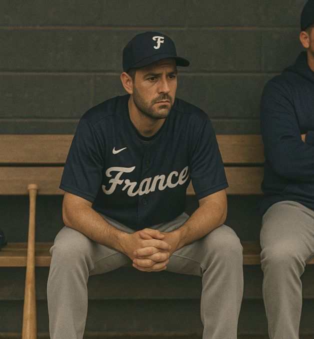
What a new breath of fresh air for French baseball! As the French Baseball and Softball Federation celebrates a century of top-level competition, the arrival of this new visual identity rings like a perfectly timed hit: clean, powerful, and resolutely turned towards the future.
Yes, the story is beautiful. The federation was founded in 1924, but it wasn’t until two years later that the very first elite championship was born. In 2026, the Division 1 will celebrate its 100th anniversary. But beware of shortcuts: baseball didn’t arrive in France at that time. It was already being practiced, driven by enthusiasts, but without a federal structure. Those who are curious can also dive into this little-known epic via the website Histoire oubliée d’un sport méconnu.
Back in 1927: the Parisian club of Ranelag won the first title of French champion. A team that disappeared today… before being reborn a little more than four years ago, thanks to the determination of fans of the glove and the ball. The championship goes through the decades, with some areas of darkness – a pause in 1929 linked to the economic crisis, then a gap in the archives between 1935 and 1954.
At the restart, a dynasty is established: the Paris University Club (PUC). With 22 titles, it still dominates the palmares today. Despite new interruptions between 1956 and 1962, the competition comes back to life, seeing the emergence of strongholds such as Nice or Charenton. Then, in the 1990s, a new face of French baseball is affirmed: Montpellier Barracudas, Savigny Lions… before the 21st century consecrated the rise of the Rouen Huskies. These last ones are preparing to aim for a 20th title in 2026, following a PUC that has just returned to the elite.
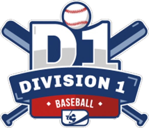
And as a symbol, the federation chose this centenary to unveil a brand new visual identity for its championships. A global redesign, from Division 1 to Division 3, not forgetting men’s and women’s softball. The creation was led by Lucas Arrighi, a passionate member, who has created a work that is both modern, dynamic and deeply rooted in the culture of baseball.
As a reminder, here is the old logo.
A visual identity that hits hard
Graphically, these new logos play the card of efficiency and impact. They feature a clean construction, centered on taut lines and geometric shapes that immediately evoke the speed and precision of the game. The variations by division and discipline demonstrate a remarkable overall consistency: each logo has its own identity while being part of a strong and recognizable graphic family.
Note finally that the logo of the Division 1 will feature throughout this 2026 season the special mention of the centenary – a nod to the history before giving way, from next year, to a streamlined version. A perfectly controlled transition, like this sport that has never stopped moving forward.
We hope that the logos of the France challenges will also follow this youthful look!